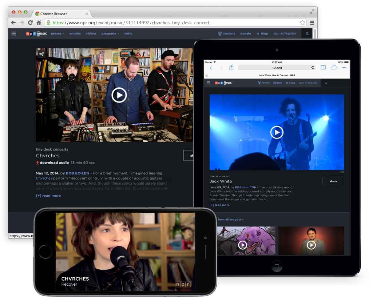
How do you create a better online music experience?
The answer to this question seems simple enough: reach users on any device and give them the experience they want. But actually building this experience requires a much more detailed answer.
NPR started thinking about this experience back in 2011 by making NPR Music’s concerts the first mobile-friendly pages on NPR.org. Looking to build more features for the audience they already had, as well as continue to grow that audience across devices, NPR asked us to start building the next great online music experience.

Interested in making your NPR music listening experience even better? Sign up to participate in an interview: http://t.co/qjYZn6CUB2
— NPR Design (@nprdesign) June 4, 2014
The value:
The vision for the product design was specific: live concert coverage, quick loading, easy navigation, in-depth search tools, content suggestions based on users’ taste, and streamlined sponsorship messages – all offered across multiple devices and screens, without a loss of experience. We worked to address this design with a timeline from a Lean UX approach: live event pages were designed, deployed and user tested all within 4 week cycles.
The results:
The result is a high-quality user experience that reaches over 27 million NPR music lovers weekly, wherever they want to be, delivering exactly what they want, and in the medium they want to view it. You can check out the Live Project and see the results for yourself.
Stats:
- Reaches over 27 million listeners weekly
- Rapid product design and deployment (4 week turnaround)
- Innovative user recruitment (relevant users culled from Tiny Desk Concerts)
- Navigation based on real user feedback
- Introduction of small breakpoints in Responsive Design
- Ability to embed on member station web-stations
- Successful Lean UX approach
- Unique approach to raising and lowering the lights to fit each device specifically
- Depth and clarity on mobile. All concert content is available on mobile for the first time, including in-show live chats and pre-show options to add the event to user’s Google, iCal or Outlook calendar. The pages are more readable and scroll-friendly on your phone
Whistle Studios provided:
- Web Design
- UX Design
- UI Design
- Information Architecture
- Product Design
- Responsive Web Design
- User Testing
- Quantitative and Qualitative Research
- Lean UX

